
DESTINATION LIGHTING
|
Client: Destination Lighting
Team: Robert Sanders, Luke Montgomery, Me Duration: 3 weeks Deliverables: Clickable Prototype (Sketch & InVision), overview document My Role: UX Designer, interviews, wireframe sketches, visual design, prototype, test script, testing, design specs. |
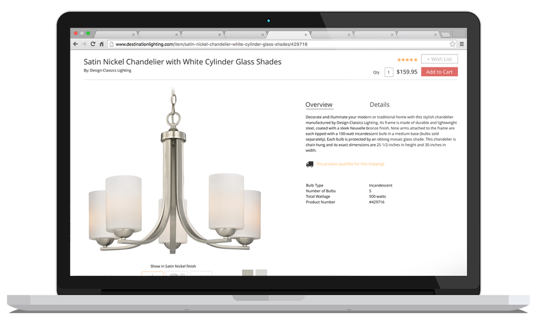
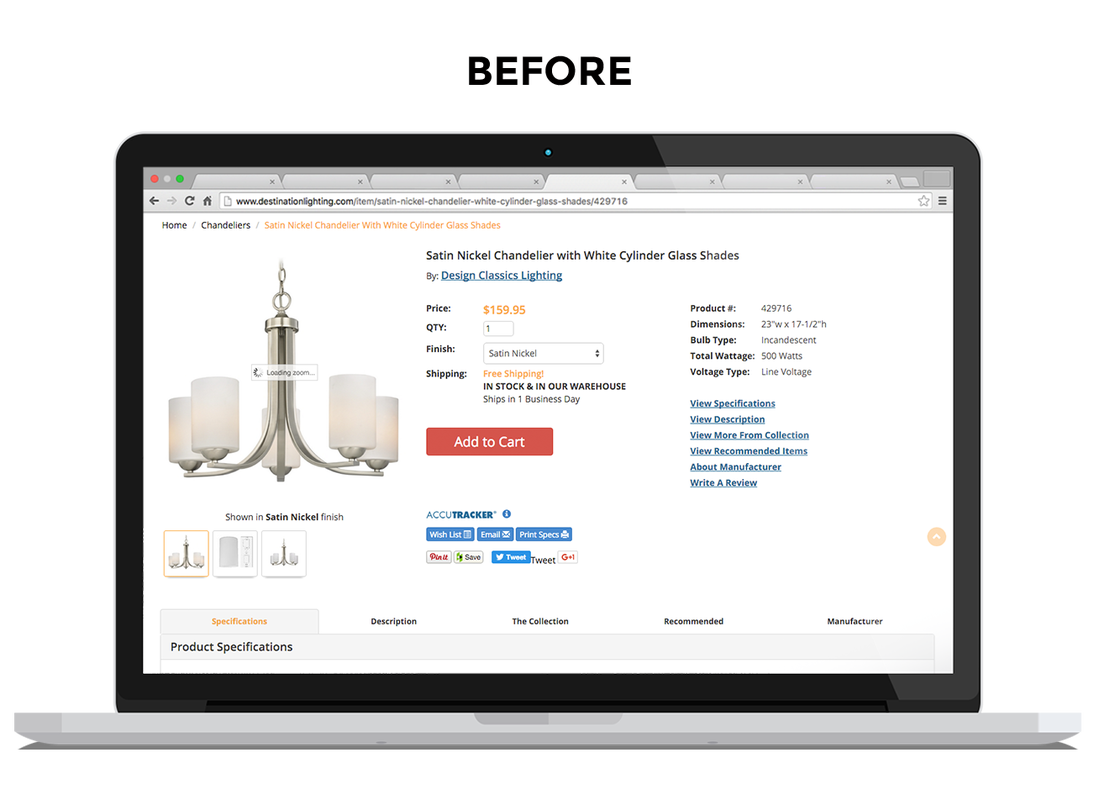
CHALLENGE: In 2014, a redesign of DestinationLighting.com resulted in a drop in sales on the desktop version of the site. The original hypothesis was that the decline in sale was tied to usability and aesthetics. My team had just under 3 weeks to present a solution.
SOLUTION: Take the elements that are of highest priority to the user and display them in a way that makes them comfortable and confident in their choice.
WHAT I LEARNED:
SOLUTION: Take the elements that are of highest priority to the user and display them in a way that makes them comfortable and confident in their choice.
WHAT I LEARNED:
- Product reviews are a major influencer on the purchasing process. Reviews build trust.
- Business needs provide boundaries in which to work, they don't have to be seen as limiting.
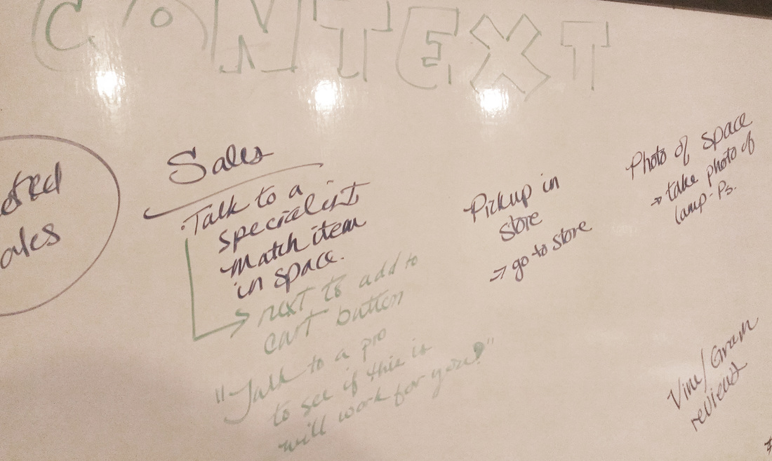
COMPLEXITIES
As we continued through interviews and testing, we found some emerging themes that began to change our initial evaluations. The customers who had purchased from the site already had no issues with navigating the site or checking out, in fact a few said that we should not change it! We eventually learned that the real issues were with the shopping behaviors of the user. People want to know that they are making the right choice and the main points that influence their decisions are price, return policy and knowing that it works in their space.
Destination Lighting also was not at a financial point to make large changes to their business models or doing much more than rearranging the content on the site.
Destination Lighting also was not at a financial point to make large changes to their business models or doing much more than rearranging the content on the site.
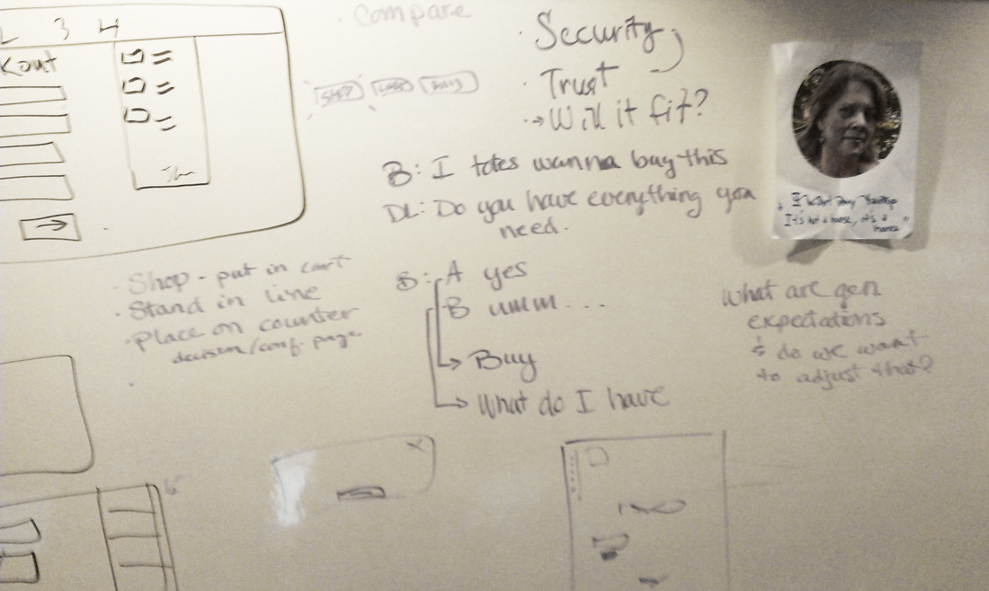
SOLUTION
Plan
We sought to make a design that gave the customer the information needed to make their decisions. We combined a lot of our brainstorming ideas and moved to wireframes quickly, focusing on visual context & trust.
|
|
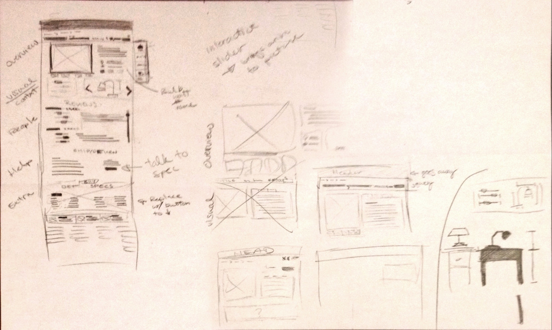
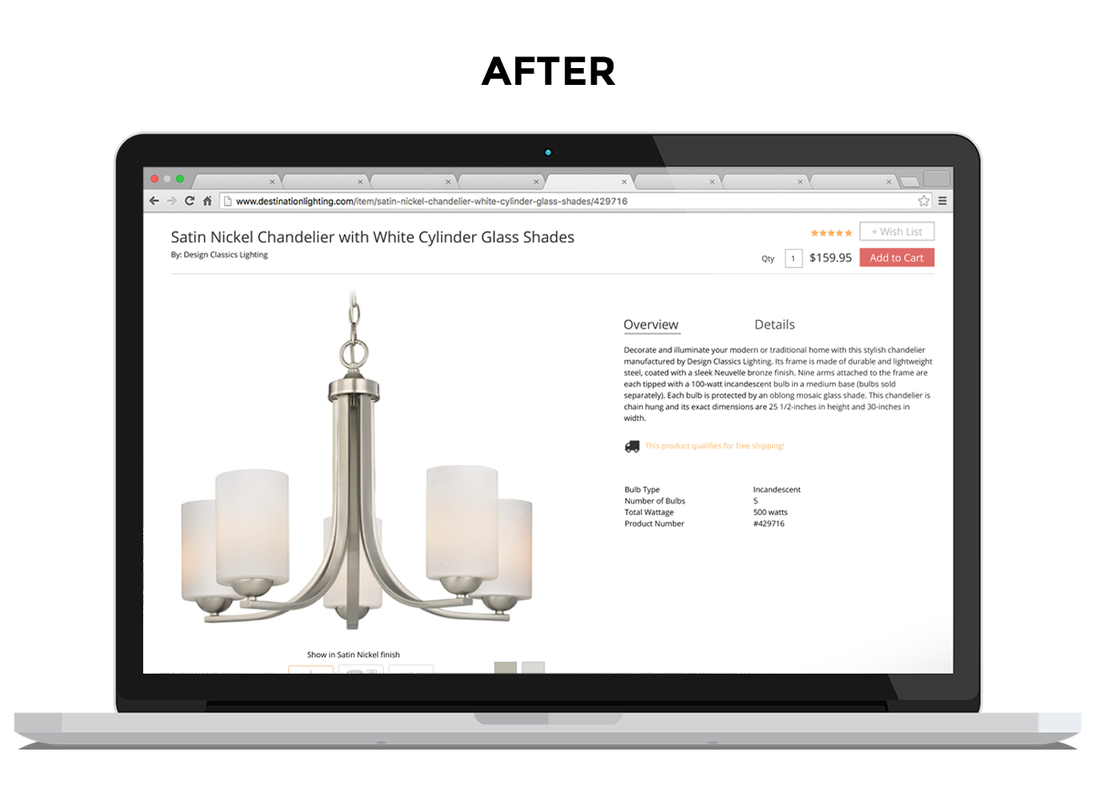
Design
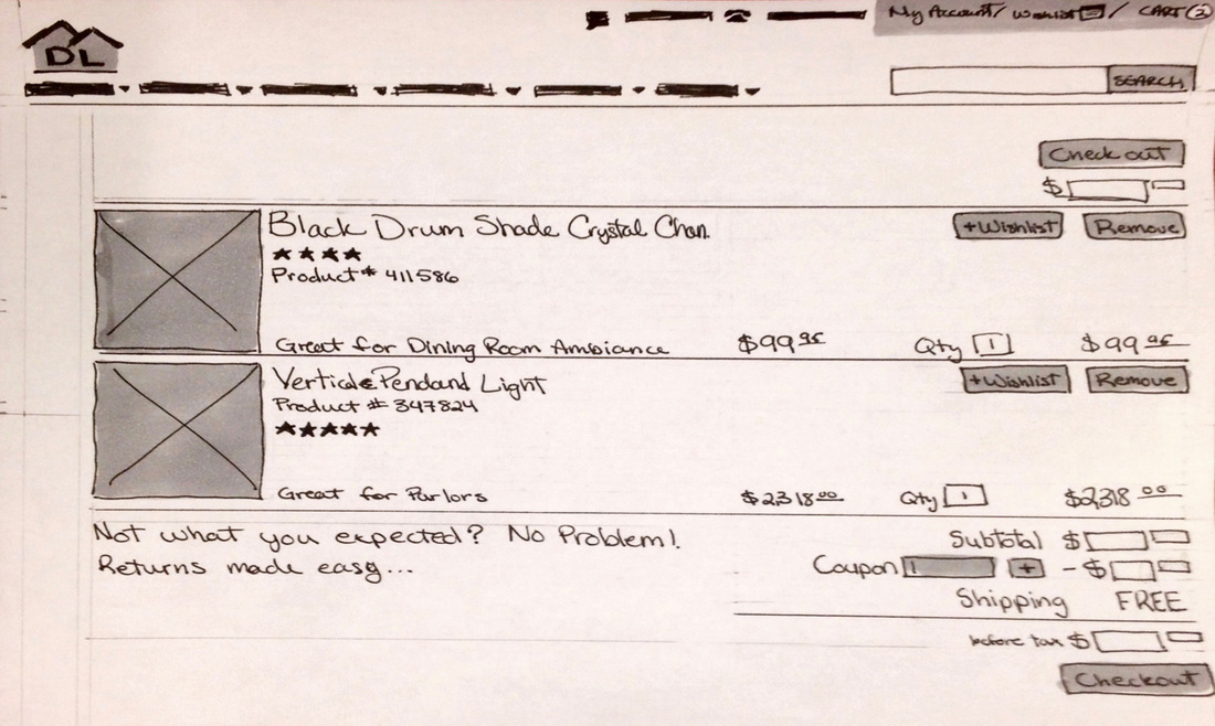
Simplified and prioritized information. Very little information was fully removed, but it was tucked away where it can be accessed when needed.
|
|
After honing in on the necessary pieces, my sketches became the base for the change.
|
|
TestWe got a lot of great data from the tests we performed. People reacted to how clean it was and how the information they needed was easily accessible.
"I like how they gave me details on the quality of the lamp instead of jargon. When I really care about how bright the lamp is." However, the graphics giving contextual info about light brightness and quality had mixed reviews. Some liked it, but thought it was interactive. Some didn't understand it. |
|
NEXT STEPS
Mid-Term (moderate investment, moderate return)
- Continue researching which specific information users need to know in order to buy.
- Invest in contextual infographic variations that will help provide better context for users (things like brightness) and will make comparing products easier.
- Research shows that contextual photos of products (such as a lamp on a table) is the best way to provide contextual information because it allows users to quickly understand light output, relative size and style relative to an environment. Based on our research we strongly recommend investing in contextual product photography.